Connecting Mentees to Mentors in Tech
Adding Features to a Web App
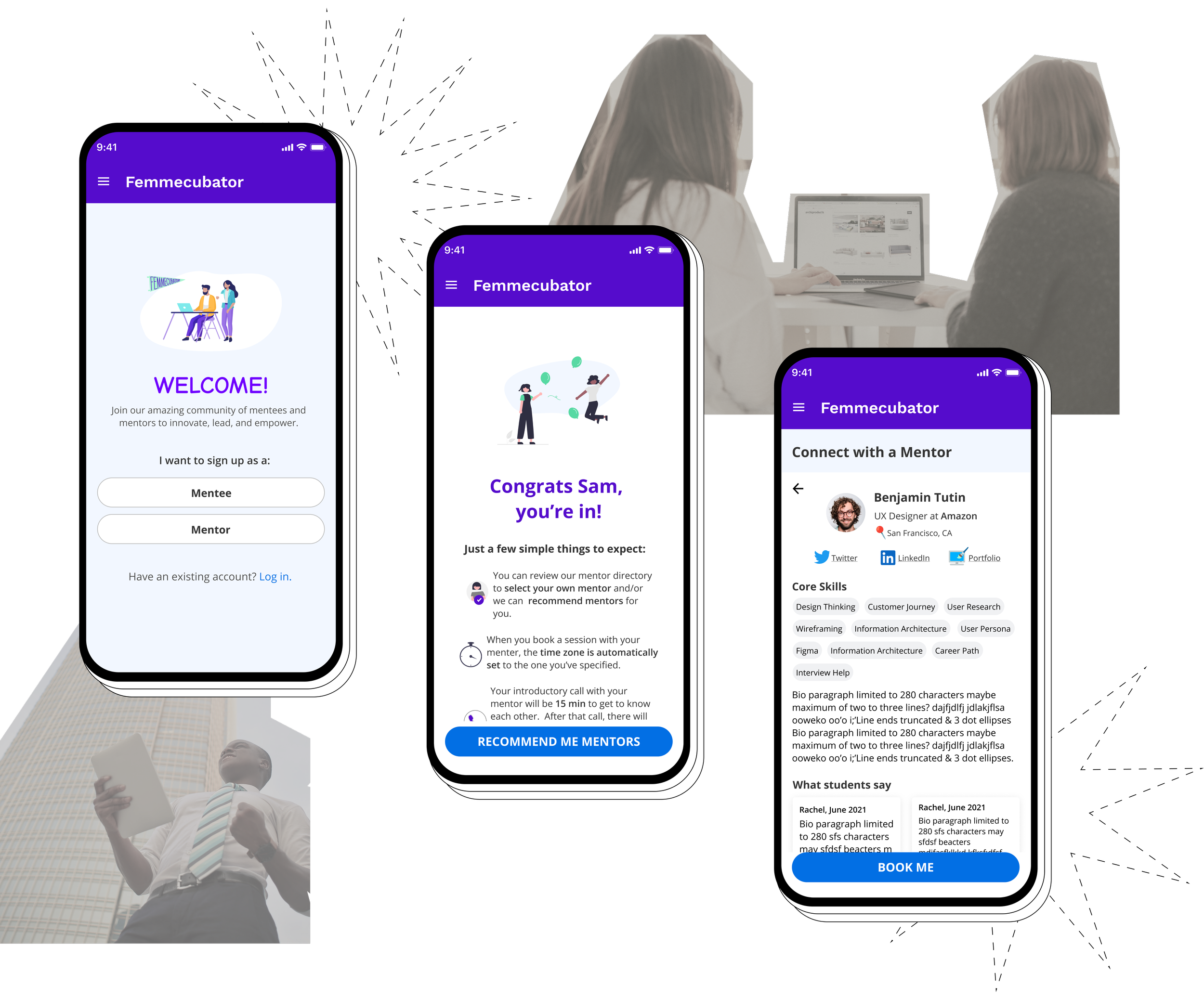
Femmecubator serves as a bridge for women of color (ages 24 to 39) in tech who have a difficult time finding a support system by offering 1:1 mentorship.
According to a recent report from the Kapor Center, only 12% of all women in computing roles are Black or Latinx. In Silicon Valley, only 2% are Black, Latinx, or Native American women.
Project Overview
Role:
Solo UX Designer
Responsibilities:
Research, Interaction & UI Design, Prototype, Testing
Timeline:
4 weeks
Client:
Femmecubator
🚩The Problem
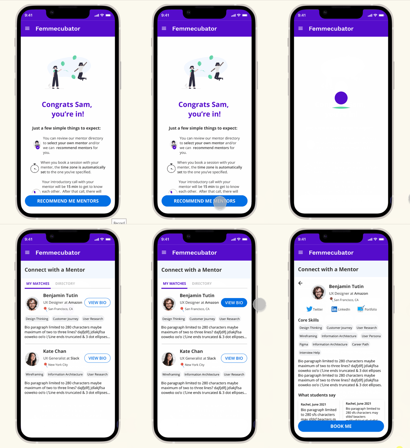
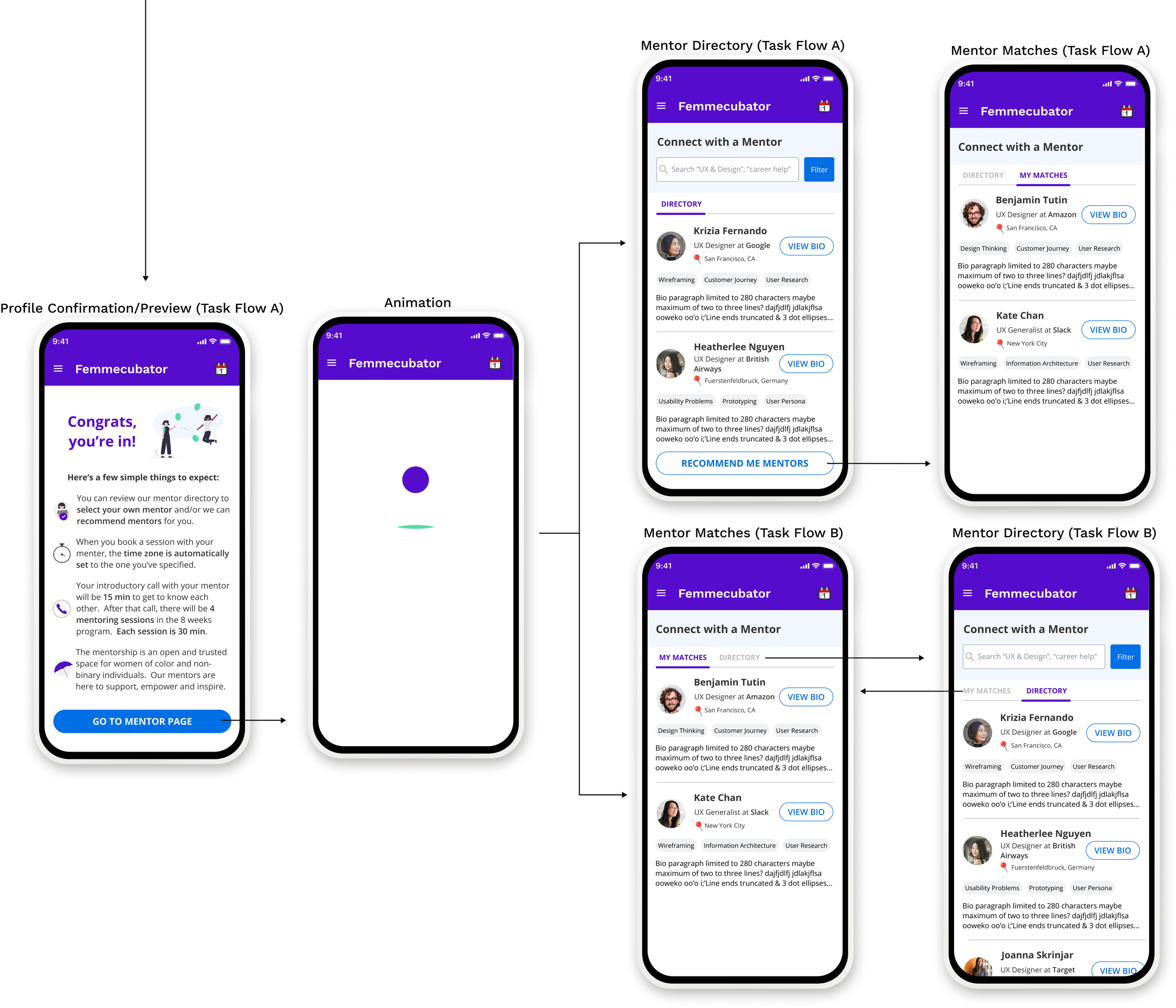
Instead of manually matching mentees to mentors, Femmecubator would like to streamline the pairing process by establishing a mentee onboarding and hybrid matching: a method for mentees to be able to select their own mentors using a directory. Alternatively, the mentees can let an algorithm find the right match.
💡The Solution
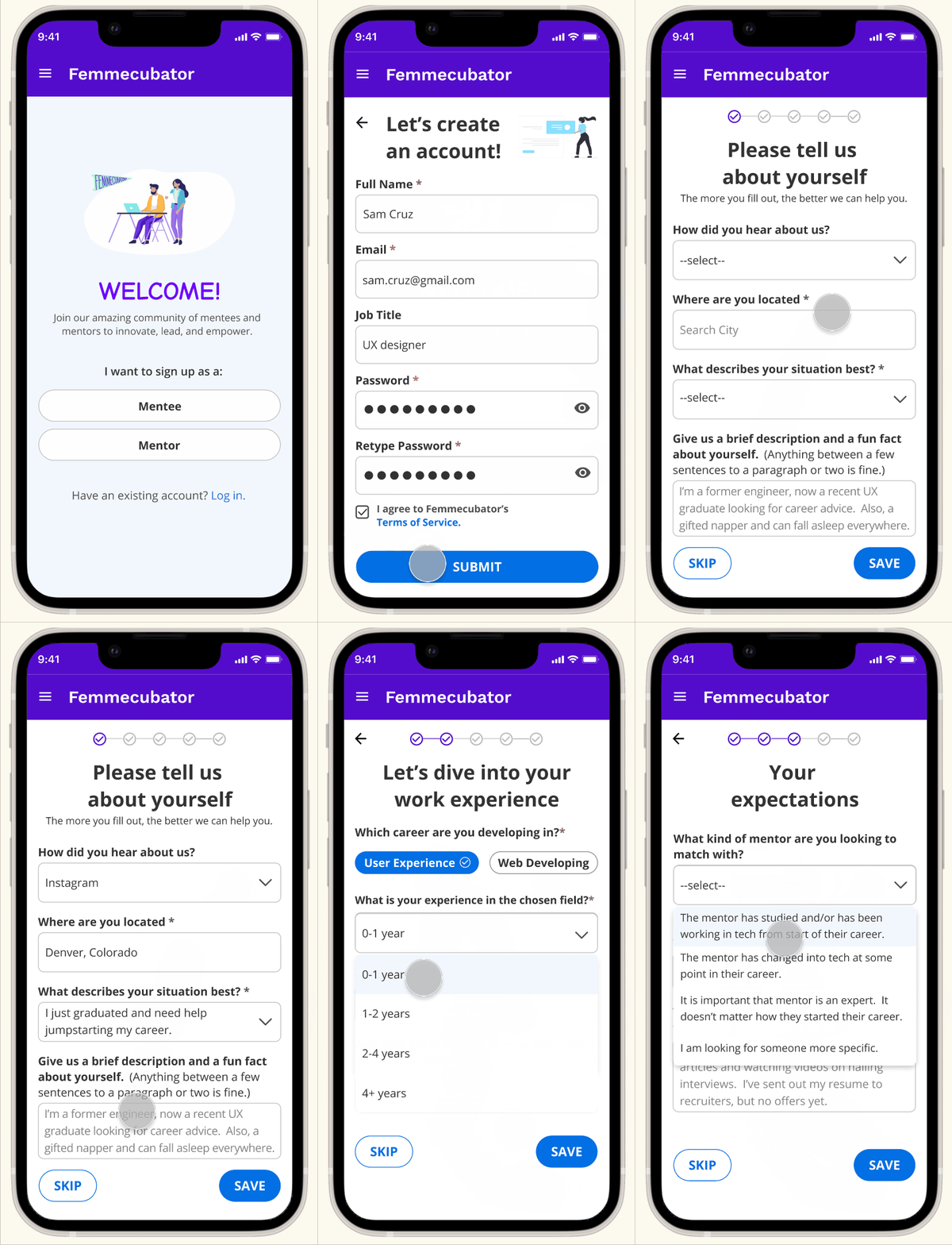
✅ I created a list of questions for the mentees to reply to, so the mentors can have a better understanding of their goals and expectations.
✅ Performed A/B testing to address the best scenario for hybrid matching.
✅ Expanded the directory in order to offer more information about mentors.
Competitive Analysis
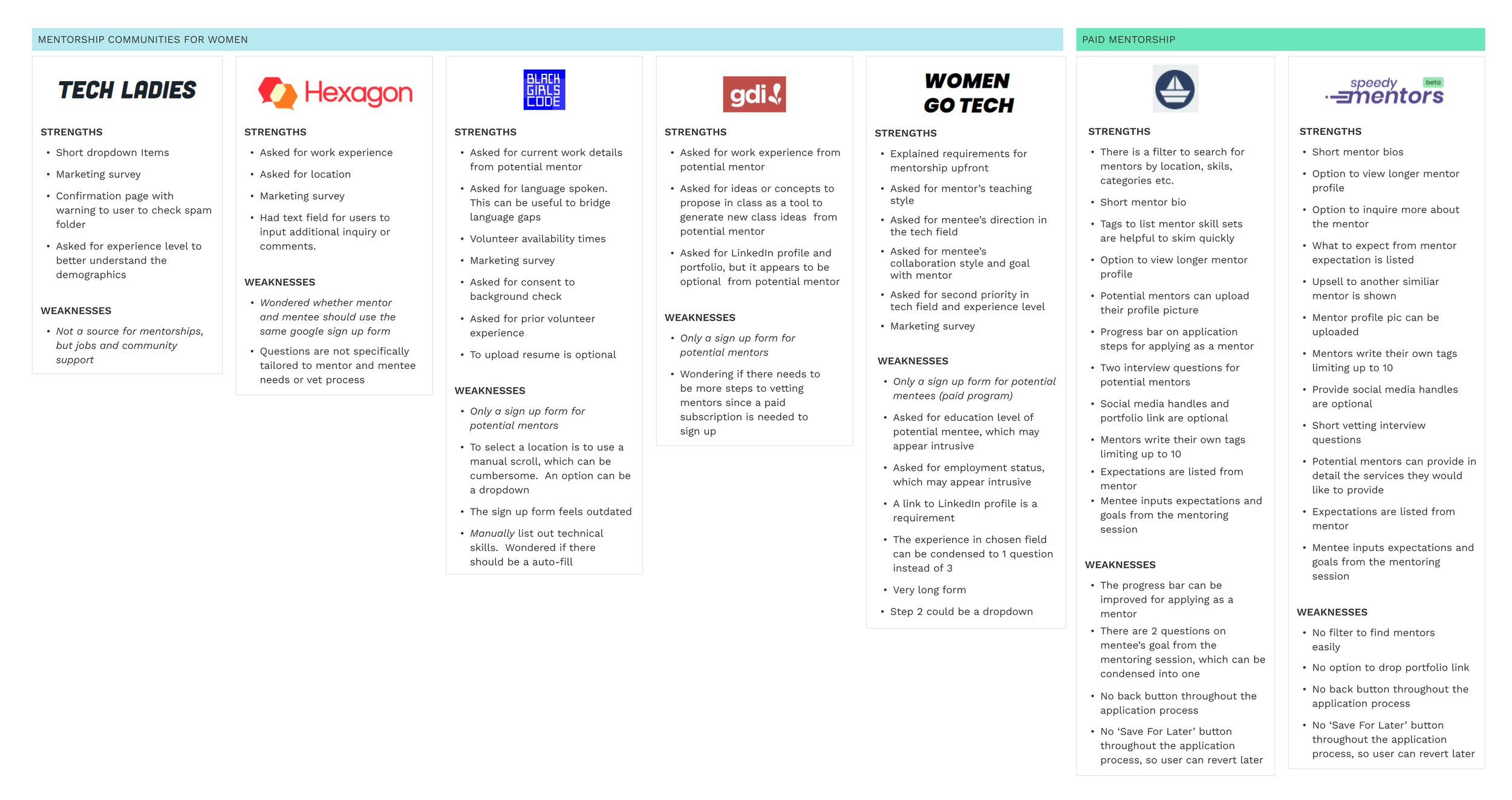
I began by looking for strengths and weaknesses in the onboarding of five mentorship communities similar to Femmecubator, which catered specifically to women or women of color in tech. Even though the onboarding for mentees and mentors should be different as both served different roles, 3 out of 5 of these communities had the same process for both. They also lacked the tools to help the mentors better understand the mentees. I refocused on pricey mentorship programs and found they had a more extensive onboarding.
✨Key Findings:
👉🏽 Notably, mentors are typically requested Linkedin and portfolio URLs. I wondered whether it would be useful to request the same information from the mentees.
👉🏽 The pricey mentorship programs offered a preview of what to expect from them.
👉🏽 I gathered a list of questions to ask mentees for the onboarding, to know more about their work experience and what kind of mentor they would like to find.
Insights from Real People
Interviewees: 5 females between the ages of 23 to 36.
Criteria: Most participants have had prior mentorship experience or are currently in a mentorship program.
Objectives:
To learn what participants expect from a mentor and what they like and dislike about their mentorship experience.
To spot pain points and opportunities to improve the current Femmecubator mentee onboarding.
To figure out how to introduce the hybrid matching- enabling mentees to find their own mentors in the directory, and/or to use the algorithm for suggestions.
📃 Full Research Findings Here.
✨ Key Takeaways
What Does a Good Onboarding Look Like
Two Ideas to Introduce Hybrid Matching
Impression of the Current Design
Empathizing With The User
The client had pointed out that there were two personas. These two personas must either graduate from a bootcamp or be self-taught because the mentoring program does not offer classes. That said, I went straight to empathy mapping.
Sketching Ideas
The research from the competitive analysis allowed me to quickly map out how the product can look. The most difficult task was to design the time picker. Since mentors and mentees live in different time zones, I created a time zone picker to help them coordinate.

Improving the Original Unfinished Task Flow
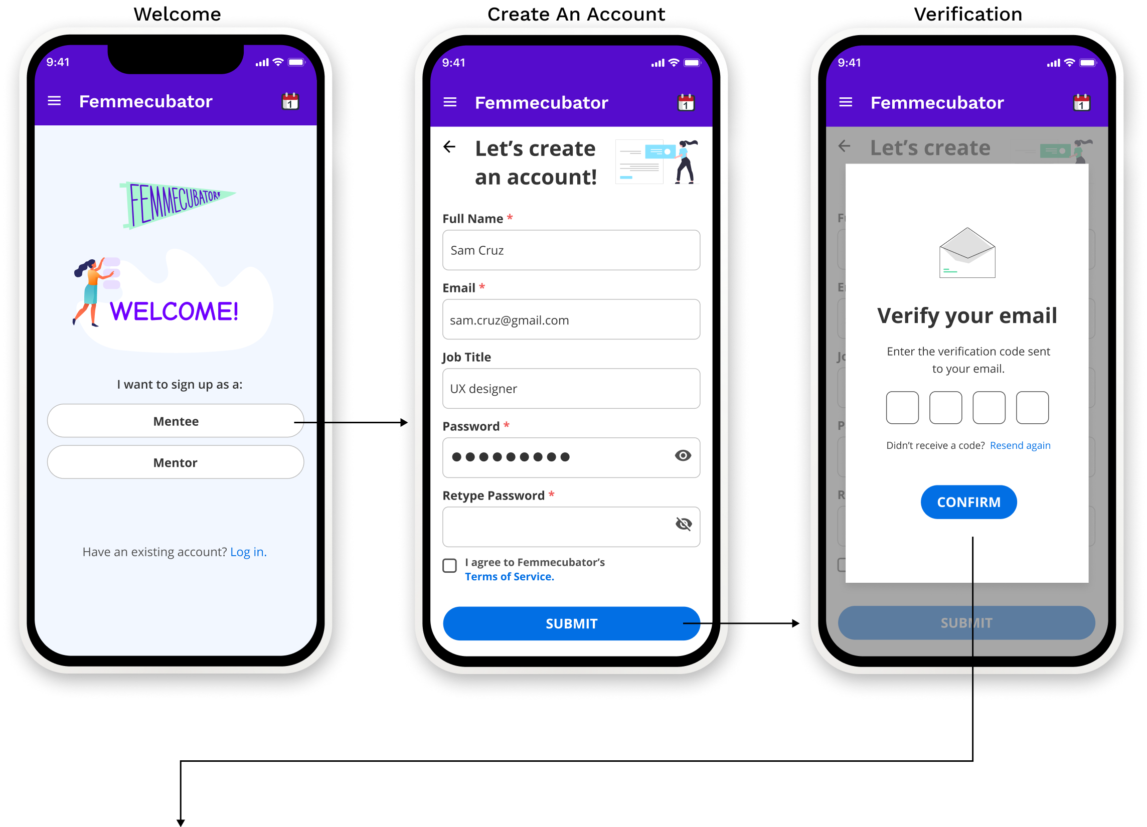
The old task flow didn’t have the correct verification flow and a mentee onboarding. Also, there were two ideas from my user interviews on hybrid matching. All are in task flows A and B. The client chose task flow A over B, so both were tested to see which users preferred and why.
✨ Design - Key Elements
Delightful Interactions
Improving Navigational Experience
Boost Onboarding Completion Time
✨ Key High-fidelity Wireframes
Welcome/ Sign up/ Verification Screens
Onboarding Mentorship Questions
Preview of Program/ Mentor Directory/ My Matches Screens
Filter/ Mentor Bio/ Hamburger Menu Side Drawer/ Edit Profile Screens
Prototyping and Validation
Interviewees: 5 participants between ages 25 to 40 with no requisites.
Objectives to identify:
The user’s first impression of the welcome screen.
How easily users are able to navigate the app effectively and spot any potential pain points.
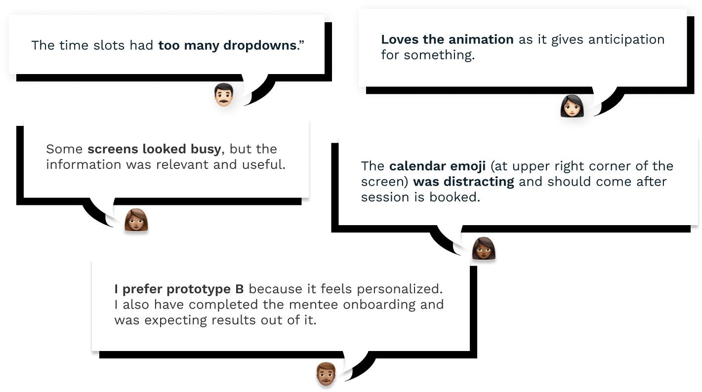
Based on A/B testing, find out which flow users prefer and why.
The problems in textual and visual information, such as unnecessary content and graphical icon confusion.
Whether users were able to easily update their time slots for mentoring.
📃 Full Findings Here.
⭐ Key Takeaways
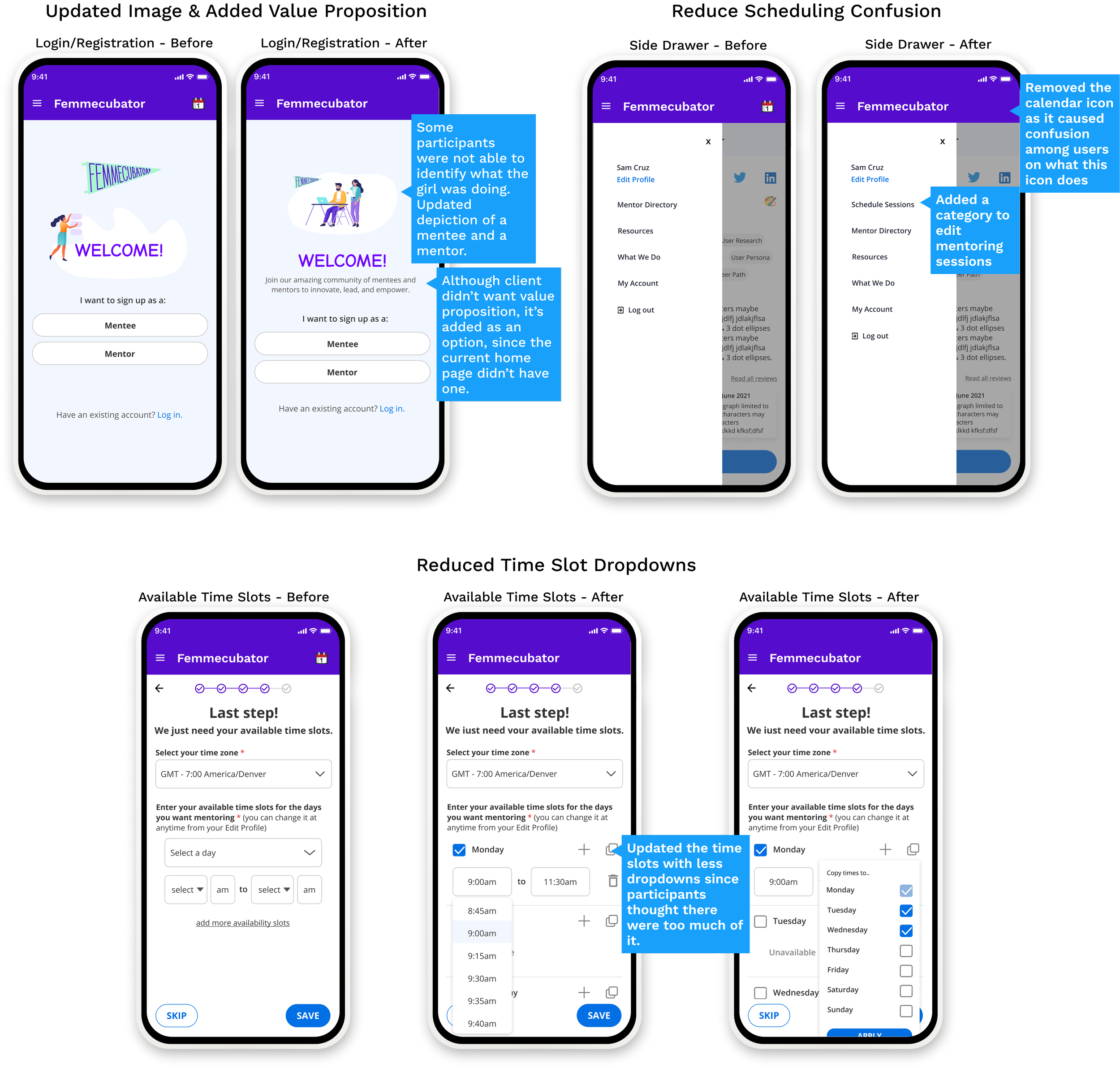
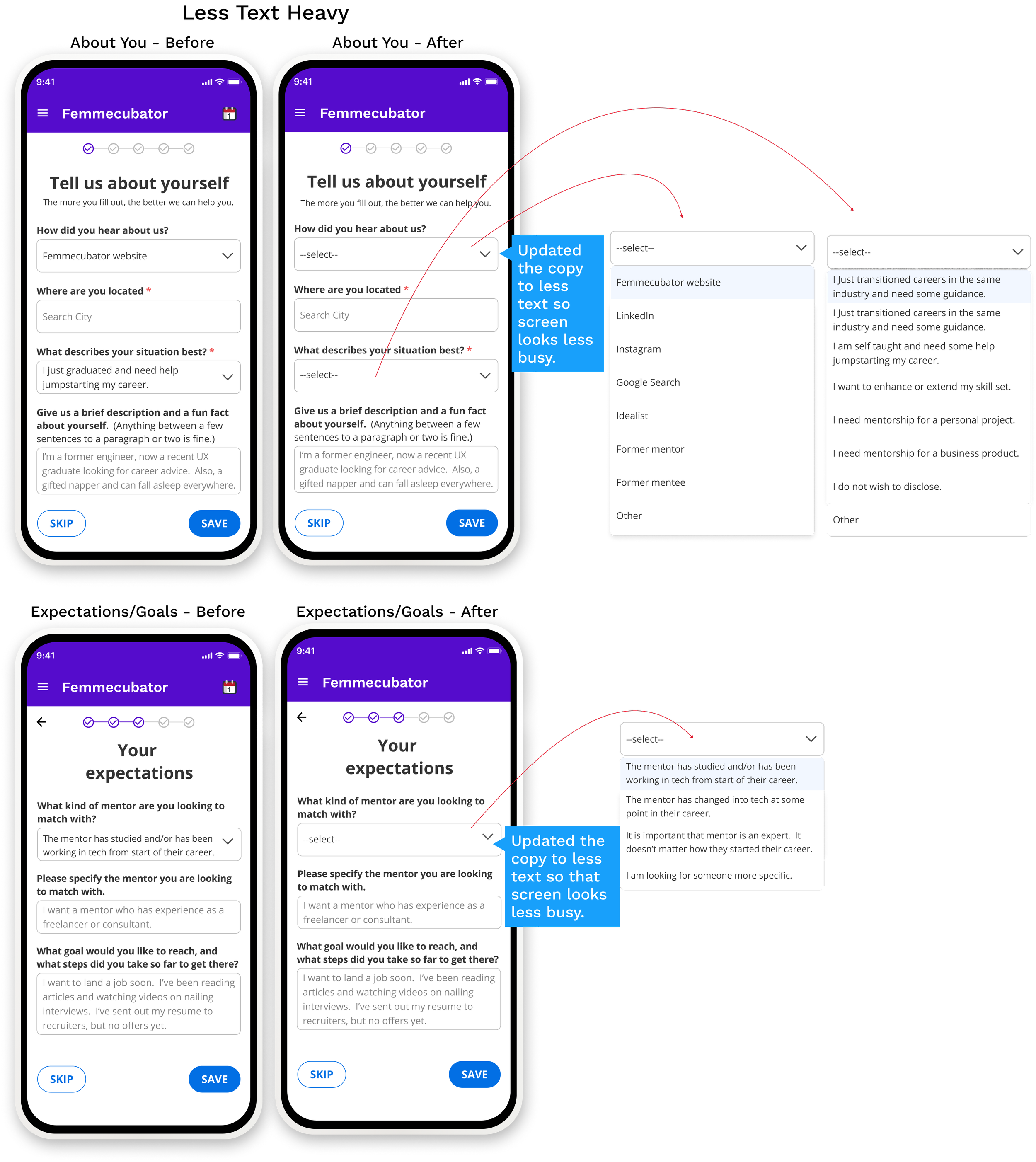
✅ The Revisions
I took the feedback to improve the UX.
🔎 The Outcome
🤔 What did the client think?
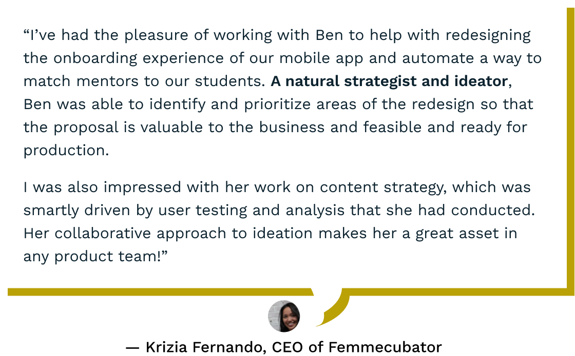
Femmecubator loved the results and is working with a developer to implement the designs. Read the testimonial:
🌱What I learned
‣ Data Over Opinion
Although the client preferred prototype A over B, it was important to let usability testing guide which prototype made more sense to the user and matched closest to a real-world scenario. After testing with users, most participants preferred task flow B over A.
‣ Storytelling in User Interviews
After trying different ways to approach a user interview, I found that structuring the questions like a story, with a beginning, a middle, and an end is a good way to conjure users’ memory and to elicit emotions.
👇🏽More case studies

