Using Augmented Reality to Get Accurate Moving Quotes
End-to-End Native App
Project Overview
Role:
Solo UX Designer
Responsibilities:
Research, UI Design, Branding, Prototype, Testing
Timeline:
5 weeks
Project:
Designlab student work
🚩The Problem
Finding a reliable moving company at the right price takes a huge effort. There are lots of movers to select from and not every one of them has an online presence. Too much time is spent comparing price quotes and reviews. The moving industry needs a digital overhaul.
💡The Solution
Using augmented reality to create a one-stop-shop moving app. It consolidates moving companies in one place to compare accurate price quotes and reviews, to self-book, and to manage inventory.
First question to answer:Is there a one-stop platfrom to easily compare moving quotes and to book online?
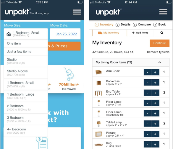
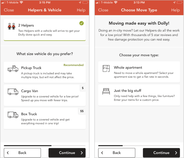
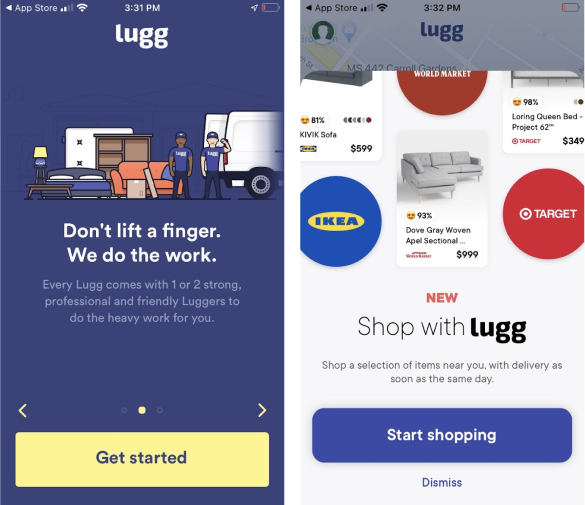
Five Competitive Analysis
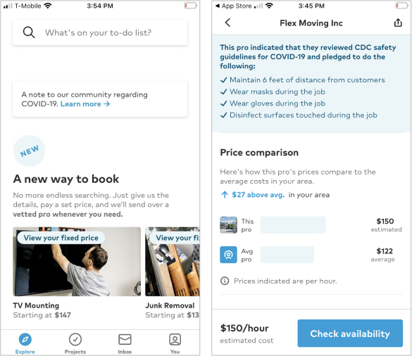
I found 5 companies that provided a one-stop moving service. Besides paying attention to each of their user flow and UI design, I also looked out for what made them unique as a source of inspiration for my project.
📃 See full competitive analysis here.
Overview:
✨Key Findings:
“ There is no platform to compare moving quotes.”
From the research, I was inspired by 2 ideas:
Five Trends Shaping the Moving Industry
Next, I searched online for industry trends to see where the moving industry was shifting.
Although the moving industry has been more reactive than proactive in using technological solutions for their business, many moving companies are investing in technology to improve customer experiences. Here are 5 technology trends that are shaping the industry:
🔃 Websites Integrated With Self-Booking Feature
People looking for a reliable moving company can reserve a move online, making their booking experience much faster and more convenient.
🚚 Instant Moving Quote Calculator
People can receive instant price estimates on the website. By doing this, they’ll know beforehand whether it meets their price point.
📍 Tracking Of Goods
GPS technology allows the client to track their goods’ location as well as the progress of the move. This provides the client with a better sense of reassurance and control.
🕙 Round The Clock Customer Support
Movers can provide 24/7 customer support through the use of AI (artificial intelligence) and chatbots.
📋 Moving Assistant Apps
There are apps that assist people with budgeting for their move and sorting their inventory list, such as Mint, Google Keep and Sortly.
Insights from Real People
Interviewees: 5 participants between the ages of 25 to 41.
Criteria: Most participants have either looked for movers or booked with a moving company.
Objective:
Learn the likes and pain points of participants’ moving experiences and spot opportunities to improve.
Identify app features that can improve participants’ moving experience.
Find out whether using augmented reality for “the room planner” is worthwhile. This tool will tell movers where to place objects in the new home. Besides AR, I want to find out what this tool looks like for them.
📃 Full Research Findings Here
✨Key Findings

Defining the User
After mapping out the responses from the user interviews to understand their experience and emotional connections, I was able to understand who my user is and what they are thinking and feeling. Here are some key points about the user:
Empathy Mapping
User Persona
Three Key Features
Based on my research and the tight deadline for this project, I focused on these 3 key features for the app:
⌚ Reduce the time filling out moving details for accurate move quotes.
📝 Integrate inventory management tool. Participants were already itemizing their move with apps like Notion or by taking pictures of their moving inventory with their phones.
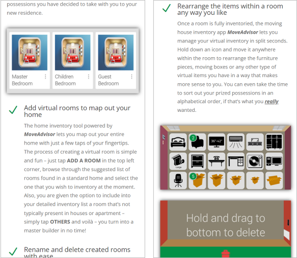
📋 Introduce the “Room Planner Tool” (ability to arrange items within the room). Participants loved this idea.
Brainstorming the Key Features
Three Ideas on How to Shorten The Moving Details
1.💡 Inventory Generator
Unpakt had a feature of automatically generating an inventory list based on the user’s move size, so I examined their current design and found that it didn’t have a lot of flexibility in editing categories and items. So, I redesigned it, but I was concerned about whether the screen looked too busy and not user-friendly. Plus, users still need to review the generated inventory to make sure it matches their own.
2.💡 Image Recognition Tool (AR technology)
I was inspired by Google Lens which uses augmented reality technology to identify objects with the phone’s camera. I tested it on my furniture and the results were pretty accurate. Not only is picture-taking fast, but the dimensions would be more precise resulting in users not having to measure their furniture to get accurate price quotes. The pictures can be stored for inventory management.
3.💡Instant Moving Quote Calculator
I researched 5 platforms that had the instant quote calculator and found that I had to manually input my moving furniture online, which was time-consuming and it didn’t offer customization for unusual objects.
Three Ideas on How to Introduce the “Room Planner Tool”
1.💡Print QR Labels
Pros
There may be future opportunities with the use of a QR code to enhance the user’s experience - i.e. tracking each item and alerting which items are fragile.
Don’t have to worry about poor handwriting.
Cons
Concerned that user has to print QR label.
2.💡Code Generator
How it works
The concept is that once users inputs on the app which room the item goes to, a code is generated, and the user will write the code on the box. Movers will read the simple code from the item and will be able to know where to arrange it. An example of a code is “LNW1” and is arranged in the living room of the northwest wall, facing from the door.
L = Living room, NW = North West, Item = item #1
Cons
I am concerned it is faster to write on the box vs reading code on the phone and then write it on the box.
Worried that the code is not readable by movers due to poor writing or is scratched during the move.
Concerned it may be a hassle for movers.
3.💡Augmented Reality (AR)
In my user interview, I asked participants to download and use the “Ikea Place” app to hear their feedback, and it was more concerned than positive.
🔥The Decision
👉🏽 Going with the image recognition tool
Picture-taking is fast.
The dimensions of the furniture are precise, so users don’t need to measure them.
Accurately identify each item for a precise price quotation.
The ability to identify items and have that item recorded in the app for inventory management and tracking is useful.
👉🏽 Implementing QR labels idea
I selected QR labels for the Room Planner Tool over the code generator because generating a code and having to write it on the item felt like too much of a hassle.
Concerned whether the code would be legible to movers.
I wasn’t confident about the QR labels idea because printing and selecting the rooms in the app can take time for users and I’m not sure whether movers would be on board with this. Since I received positive feedback for the room planner feature in my user interviews and as a learning experiment, I proceeded to prototype and do usability testing to learn how users respond to it and to improve.
Plotting User’s Actions
I explored the possible paths the user takes inside the product with a user flow. While laying out the path, here are some things I kept in mind:
➡️ Simplify and shorten the navigational flow.
➡️ Anticipate shortcomings or unexpected surprises.
➡️ Reduce potential hesitations from users.
Use Familiar Patterns
I looked at common patterns from other brands for inspiration. This way it doesn’t require additional explanation since users are already familiar with them. This allows them to use prior experience to interact with the app with no learning curve
Envisioning How the Product Looks
It is impossible to build an idea without hashing out the details first. Drawing from my sketches, I created the mid-fidelity wireframes.
Developing an Impressionable Brand
🖌️ A Sleek Design
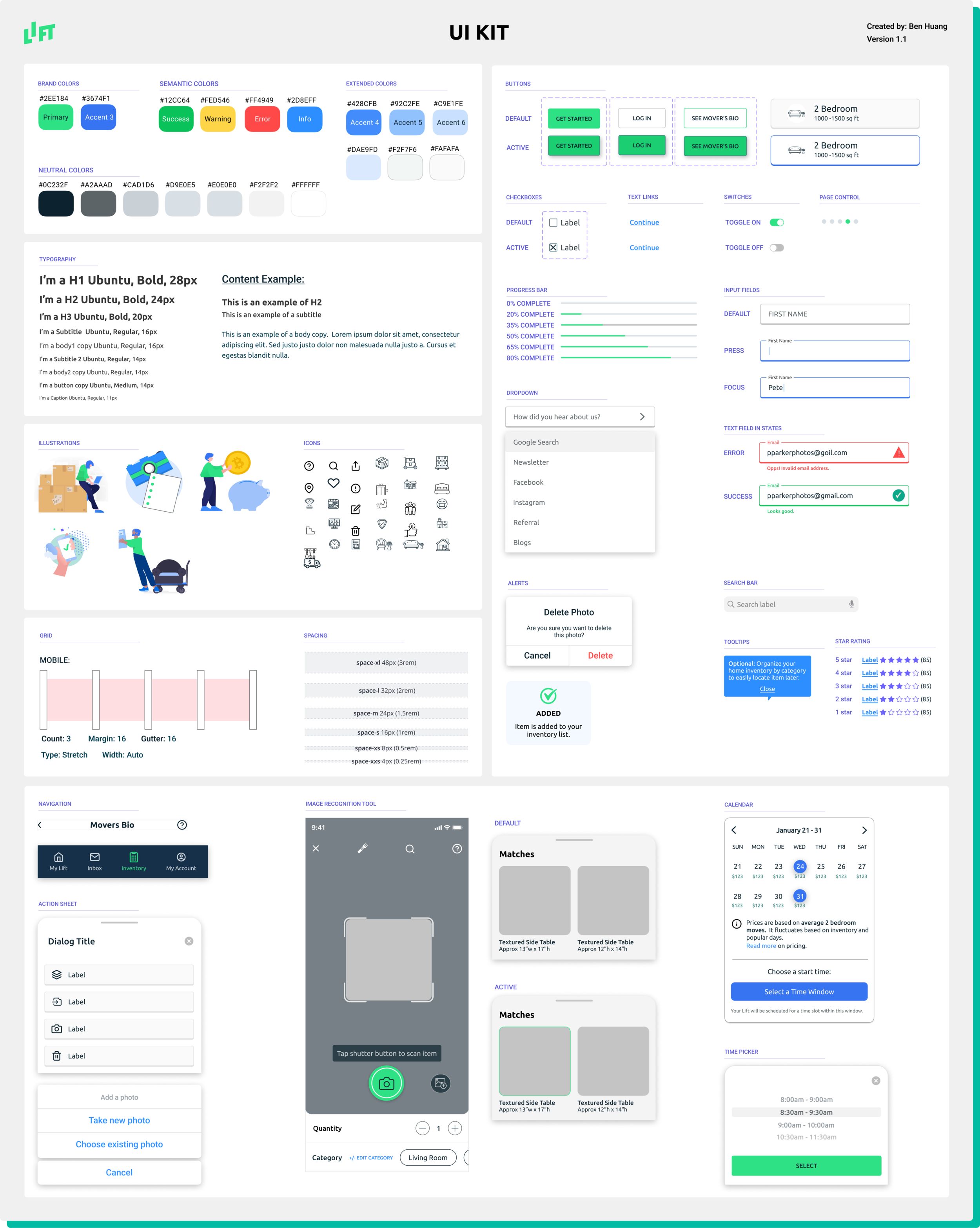
To help the business stand out from its competitors while keeping my “practical” persona in mind, I stayed away from bold, bright colors that most moving companies use for their brands. I was inspired by Fintech designs that use a lot of green and blue, which brings trust and loyalty. Since my persona is practical in their decision-making, I wanted a minimalistic, sleek, and no-fuss design.
🎨 Graphics
I wanted light-hearted graphics that is informational. They should be coherent to the brand and theme of the project.
🗛 Font
I chose Ubuntu font type for its modern appeal, great readability and its wide range of font weights.
🚗 But… your brand name sounds like Lyft
Yes, “Lift” does sound the same as Lyft, the car service giant. But, it has its own unique design, logo, and color combinations. I like the name “Lift” for its simple pronunciation and it’s easy to remember. The intention of the letter “i” going slightly higher aligns with the business of lifting and moving objects. The thick letters to the logo represent the brand’s personality of strength and toughness.
✨ Design - Key Elements
✨ Key Hi-fidelity Wireframes
Walkthroughs, Sign-up and Verification Screens
Move Details Screens
Image Recognition Tool and Inventory List Screens
Quote Comparison, Mover’s Bio, Payment and Booking Confirmation Screens
“Room Planner Tool” Screens

Prototyping and Validation
Interviewees: 5 participants between ages 26 to 31.
Criteria: Most participants have either researched for movers or booked with a moving company.
Objective:
Evaluate how easily participants are able to use the app.
Learn whether they understand how the Image Recognition Tool works and if it needs improving.
Find out whether recording their inventory and using the QR Label feature is useful.
Identify problems in textual and visual information, such as labeling, graphical icons, and illustration confusion.
📃Full Research Findings Here
✨Key Insights
✅ The Revisions
Based on the results from the usability testing, I removed the Room Planner Tool since participants felt it required more effort than simply writing instructions to movers on the box. I made further revisions collected from the feedback.
🔎 The Outcome
🌱What I Learned
‣ Great Idea vs Reality
In my user interviews, most participants loved the idea of having the ability to tell movers where to place their furniture and boxes in a room. However, when this feature was built and tested with users, they didn’t care for it. Sometimes, nothing beats the old fashion way, in this case, writing on a box with a marker.
‣ The Complexity Of Simplicity
I started off this project with lots of ideas to choose from, like adding international moving service and real-time tracking of mover’s progress. Without a UX team and just a 1-month deadline to build this product, I had to slim down my ideas. I did pursue the Room Planner Tool but early on, I realized it might not work. I really did want it too though. I thought maybe keeping the product too simplistic wouldn’t get enough people to use it. But, after testing with users and finding this tool was a no-go, in this instance, simplicity is the better route to a good user experience.
👇🏽More case studies


